
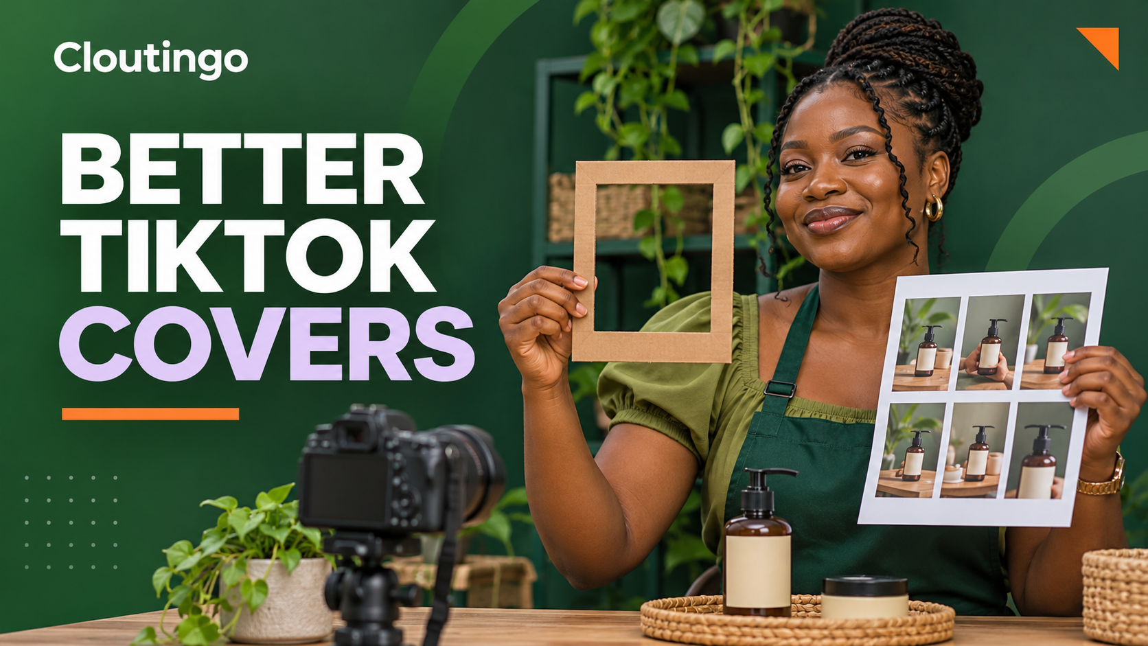
How Nigerian Online Sellers Can Choose Better TikTok Video Covers
A strong TikTok video cover gives a shopper one clear reason to open your post. For a Nigerian online seller, the best cover is usually a sharp frame that shows the product, result or question without making the viewer decode a crowded design. Choose it before you publish, then review it at the small size people will see on your profile and in search.
TikTok describes a video cover as the preview thumbnail shown in places such as a profile or search results. Its publishing guide says you can choose one on the post screen by selecting Select cover, moving the frame to the image you want and saving it. That makes the cover a small but useful piece of your product presentation, not a promise that the platform will recommend the video.
Decide what the cover must communicate
Start with the job of the video. A demonstration, comparison and customer question need different opening images. If you try to show every benefit on one cover, the result becomes difficult to read on a phone.
Write one private sentence before filming: “This cover should help a shopper recognise ______.” The blank might be the product, the use case, the colour difference or the question being answered. That sentence is your selection rule.
- Product reveal: show the item clearly, not the presenter’s hand covering the label.
- How-to video: show the important action or the finished setup.
- Comparison: place the two options in the same frame with enough separation.
- Question-led post: use a relevant expression or object, with only a few words if text is necessary.
A cover should represent what the video actually contains. A frame that suggests a different product, price or outcome may win a tap but lose trust as soon as the video starts.
Film a frame that can become the cover
Do not wait until the edit is finished to discover that every useful frame is blurred. Build a short “cover moment” into the recording. Hold the product or finished result still for about a second. Keep the main subject away from the extreme edges and leave a quiet area if you intend to add a short label.
For beauty, food, fashion and gadget sellers, small physical details matter. Turn the label towards the camera. Remove glare from plastic packaging. Make sure a fabric colour is not distorted by a strong filter. If the video explains a process, choose the step a new shopper can recognise without context.

Use a five-point frame check
Pause on several possible frames and assess each one with the same questions. This prevents the team from choosing a cover simply because one person likes it.
- Recognition: can a shopper identify the subject immediately?
- Sharpness: are the product, face or key action in focus?
- Truthfulness: does the frame match the video’s actual offer and explanation?
- Crop safety: will the main subject remain visible when the preview is small?
- Difference: can this post be distinguished from the covers beside it?
The last point does not mean every post needs a new colour system. It means adjacent covers should not become nine near-identical faces, packages or text cards.
Keep cover text short and useful
A good frame may need no text. When words add context, use a short phrase that survives a small preview. “Shade test”, “Three sizes” or “How it folds” is more readable than a full sentence. Avoid claims that the video cannot prove and do not hide important product details behind large lettering.
Check contrast rather than relying on a decorative font. Light text over a light wall disappears. Thin lettering over patterned clothing becomes noisy. A plain text area or subtle solid strip is often easier to scan. The purpose is orientation, not poster design.
Build a profile grid people can scan
Your covers can work as a simple navigation system. Create visual lanes for recurring content rather than forcing one template on every post. For example, a skincare seller could use close product shots for ingredient explainers, hands-on scenes for routines and two-product frames for comparisons. The viewer can recognise the format before reading a caption.
Keep the relationship between posts visible through consistent lighting, spacing or one small label position. Change the subject and composition enough to reflect the video. Consistency should reduce confusion, not make every cover look copied.

Review the sequence before you publish
Create a contact sheet of the next six to nine covers, or place screenshots in a simple grid. Reduce the grid until it resembles the size of a phone profile. Then ask:
- Does each cover still have one obvious subject?
- Are two important products cropped in the same confusing way?
- Is one text label much smaller than the others?
- Can a first-time visitor tell which posts are demonstrations and which are comparisons?
- Does any frame create an impression the video does not support?
This review is especially useful when different staff members film and edit content. Save the chosen frame beside the approved caption so the publisher does not have to guess at the final step.
A hypothetical Lagos product example
Imagine a Lagos seller preparing three videos for one body lotion. The first shows how much product to use, the second compares the two bottle sizes and the third answers whether the cap can lock during travel.
The first cover can show the measured amount on a clean palm. The second can place both bottle sizes upright. The third can show a close view of the cap in the locked position. Repeating a smiling presenter with the bottle in all three frames would hide the useful difference between the posts.
This is an illustrative content-planning example, not a claim about sales or reach. The covers help organise the explanation. The videos still need accurate product information, a clear demonstration and an honest caption.
Avoid these common cover mistakes
- Choosing the first frame even though the presenter is mid-speech.
- Using a reveal frame from before the product appears.
- Adding so much text that the item becomes secondary.
- Using a stock image that never appears in the video.
- Cropping a face, label or comparison at the edge.
- Making every post look like the same advertisement.
Because the official publishing flow asks you to select the cover before posting, treat the final cover check as part of approval. Confirm the frame, crop and spelling before you tap publish.
Promote only after the destination is ready
A cover improves how your existing content is presented. It does not replace the video, product page, customer service or organic content plan. If you later use paid social media promotion, confirm that the public post opens correctly and that the service matches the intended platform and content type.
Cloutingo lists current TikTok and other social media options on its services page. Individual services have different audience, quantity and delivery conditions, so read the description and the current terms before ordering. Promotion cannot guarantee recommendations, buyers or sales. When the post and destination have been checked, you can create a Cloutingo account and choose only a service that fits the campaign.
Your next cover decision
For your next TikTok post, save three possible frames, reduce them to preview size and choose the one that communicates the video’s single promise fastest. That small discipline can make your profile easier to understand while keeping the content honest.